Visit the Website
Project Notes:
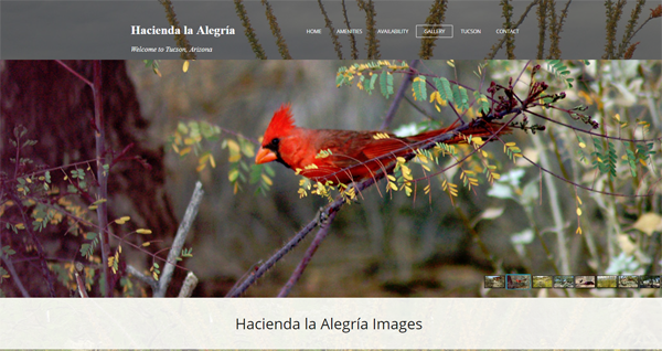
The new Hacienda la Alegría website is an example of an upgrade of a older (and broken) website to achieve a visually appealing new look with responsive features. The concept was to showcase the visual beauty of the setting, describe the cozy "casita" with full set of amenities, and persuade the viewer to fall in love with Hacienda la Alegría.The website features a basic availability calendar, but due to privacy preferences, reservations are made the old fashioned way via phone and a personal touch.
Images of this lovely desert property are displayed via a full-screen photo gallery and also in other pages using a "parallax" effect that viewers will find intriguing.