Visit the Website
Project Notes:
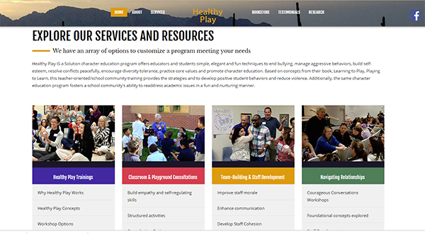
The new Healthy Play website is an example of an upgrade of a older (very dated) website to achieve a visually appealing new look with responsive features. Almost everything was ripe for change - navigation, content, pictures, you name it.Images of client workshop activities are displayed via a full-screen photo gallery that helps to tell the story of what the various training options entail. The home page especially is full of movement and visual effects that are pleasing to the eye and help to generate excitement. The tasteful use of color helps to produce a consistent theme throughout the website.